

Responsive Web Design
- Mobile conversion, Device selection
- Responsive web design practice
Efficient RWD practice with HeartCore
Table of Contents
1. Introduction
Responsive Web Design is becoming a conventional web design norm along with the popularization of smart phones and tablets. However it is said that CMS and Responsive Web Design are incompatible. HeartCore is actually the only CMS which allows you to manage responsive web design effectively. This page describes how you can put it into practice.
1.1. What is Responsive Web Design?
Responsive Web Design is a web design approach to adapt a website layout for optimal viewing on multiple devices such as smartphones, tablets as well as laptop and desktop computers based on screen size. It enables to provide the best experience possible to the user in terms of navigability and readability no matter how large/small screen the device has.
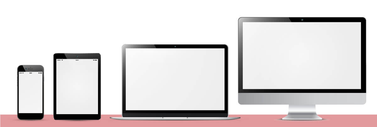
A number of different devices with various sizes and specifications are already used to view websites. Even among smartphones and tablets, there are a lot of different sizes and communication methods including Wi-Fi, 3G and LTE. In addition, other devices of late such as game consoles, car navigation systems as well as TVs have web browsing feature. As new devices are launched with remarkable rapidity, web designers and developers have to deal with not only the existing devices but also as-yet-unknown ones. This is why responsive web design is becoming more and more popular.
1.2. Pros and Cons of Responsive Web Design
What are the pros and cons of website management using responsive web design? There are different opinions, but major ones are as follows.
Pros
1. Low maintenance
With a responsive design you only need to maintain one website. While the layout changes, the content stays the same across different devices. You can simultaneously update content or fix bugs for all devices.
2. Brand consistency
With one website that works on both desktop and mobile screens, you will find it much easier to keep up a consistent brand identity./p>
3. User-friendly experience
Responsive web design is highly user friendly. Not only can your visitors better relate to your brand if they recognize your website on mobile, they also know better how to use it. A consistent style and consistent content is important because users don’t expect it to be different just because they use a different device.
4. No server-side configuration, for example for redirections
The fact that you only have one website for all devices also means that you have the same page URLs to deliver content to all your users. You don’t need to worry about redirects or incompatibilities between different devices. For example, when sending out newsletters, chances are high that your readership will open your email on a mobile device. You don’t want them to have to switch to a desktop computer or laptop before they can open your links. No redirection also means that server-side configuration is not required either.
5. High ranking in Google organic search
Google officially and strongly recommends responsive web design to build a website for multiple devices. Building separate pages for each device and having redirects on those pages is always associated with unavoidable problems. However, the fact, “one source code for one URL” resolves the problems and such websites rank higher in search results page.
Cons
1. Longer development time
Probably the most obvious minus point about building a responsive website is that it takes more time. Obviously, for a regular desktop site you need way less preparation time, less resources to build it, and also testing it requires less effort.
2. Unable to provide device specific content
The idea that you can simply build one website that works equally well on any device may be a myth. People will browse your website according to their very specific needs and goals, and not to mention their unique context of use.
3. Not supported in old versions of browser
Responsive websites work with media queries to determine the screen size of every visitor and then display the correct layout. The problem here is that old browsers, especially Internet Explorer version 8 and older, don’t recognize media queries.
4. Scalable images lose details
Another limitation of responsive design is the scaling of images. This problem can be resolved by using large images, still there remain a performance concern.
5. Need to make navigation menus intuitive
Navigation menus make up for an important part of any website especially on more complex desktop websites. On smaller devices you will always encounter limited screen real estate, which makes designing intuitive navigation menus a challenge.
1.3. Responsive Web Design and CMS are incompatible?
Both responsive web design and CMS work with one source for multiple devices. Then why they are considered incompatible?
Responsive web design changes and adapts a page appearance for optimal viewing on multiple devices by using grid layout and media queries, while CMS generates a page for each device by putting parts together. Therefore building a responsive website using CMS causes double work and ends up costing more. This why people think responsive web deign and CMS are incompatible with each other.
However, HeartCore can disprove such a prejudice.
1.4. How do general CMSs support Responsive Web Design?
If you try to implement responsive web design using general CMSs from other vendors, they will probably discourage you from doing it for the reasons as follows.
- Low maintenance? Not always true. With CMS, managing a website using respective HTML files for each device is almost equal to responsive web design in workload. Rather, when new components or design parts need to be added, responsive web design requires more time.
- Brand consistency? You can and should create a consistent design layout even when you use different HTML files for multiple devices with CMS.
- User-friendly experience? Not completely. It is not always possible for one website to stay user-friendly when it is viewed from different devices. Since where and how navigation menus are displayed differ depending on the screen size of each device, users still need to learn more or less how to find information they are looking for.
- No server-side configuration (redirects)? Once these settings are configured, special configuration is no longer required. Also, it is also possible to use the same URL for different devices with Apache configuration etc. The most important thing is not to implement responsive web design but to develop a website with optimized layout, design and images for each device.
The above are certainly true, but the explanations are just excuses and go against the times. These vendors recommend such methods because it is not possible to build a responsive website efficiently with their own CMS.
2. Basics of Responsive Web Design
This section describes how you can start responsive web design. The followings are the basic techniques.
Responsive Web Design consists of a mix of a flexible grid system called “Fluid Grids” and flexible images called “Fluid Images” and a use of CSS3 media queries. Media queries enable you to style a page based on different display surface factors such as width, orientation and resolution etc.
Fluid Grid
Convert the width of each element used in a grid layout from an absolute width (px) to a relative width (%).
Ex.
#container{width: 100%;margin:0 auto;}
.left-column {float: left;width: 70%;}
.right-column{float:right;width:30%;}
Fluid Image
Specify the “max-width” of images with a relative size (%) to adapt the images to load differently depending on the device.
Ex. img{max-width:100%;}
Media Queries
You can switch styles to be applied to the page depending on the screen width by setting “breakpoints”. How many breakpoints and what pixels you should set is up to your website layout and target devices.
1. Use media queries directly in a stylesheet
Ex. @media screen and (max-width: 800px) {…}
⇒The styles inside {…} are applied when the screen width is equal to or smaller than 800px.
2. Use media queries with @import rule
Ex. @import url(smartphone.css) screen and (max-width: 480px);
⇒The“smartphone.css” is applied when the screen width is equal to or smaller than 480px.
3. Use media attributes in the <head> of HTML
Ex. <link rel="stylesheet" media="screen and (min-width: 768px) and (max-width: 1024px)" href="tablet.css" />
⇒The“tablet.css” is applied when the screen width is equal to or wider than 768px and equal to or smaller than 2014px.
Others
Define a “viewport” meta tag on your page to alter/ disable the "zoom in" behavior of mobile browsers. This makes the entire content visible on the screen.
Ex. <meta name="viewport" content="width=device-width,initial-scale=1.0">
Also, add the following scripts in the to enable HTML5 and media queries in MSIE 8 and below.
Ex.
These are the basic techniques of responsive web design. Please refer to general documentations for more details.
3. Responsive Web Design with HeartCore
Let’s see how you can effectively practice responsive web design using HeartCore.
3.1. HeartCore Features
Unlike other CMSs, HeartCore is able to manage content as MVC. MVC (Model View Controller) is a web design pattern and used to design programs with GUI. It is commonly used for application development. So what does it exactly mean to manage content as MVC? Simply put, it is an architecture which enables to manage design, function and data as separate contents and generate a page by reference to those contents.
Developing a responsive website with HeartCore is also based on this concept. In responsive web design, HTML corresponds to data, CSS corresponds to design and JavaScript / CSS control corresponds to function.
For example, responsive web design requires HTML+CSS3 control to create a grid-based layout. With HeartCore, such controlling parts can be replaced with @@@ special codes.
Setting Media Queries Breakpoints
You can define any values as breakpoints with arbitrary names and replace them with special codes.
-HeartCore Configuration Page- Define any names and input values.
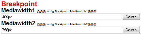
-Media Queries- Replace the fixed values with special codes.
@media (max-width: 480px)
↓
@media (max-width: @@@config:Breakpoint:Mediawidth1@@@)
@media (max-width: 768px)
↓
@media (max-width: @@@config:Breakpoint:Mediawidth2@@@)
With such special codes, you only have to update one place when you want to change breakpoint values instead of having to update every place where the breakpoints are written in stylesheets. The updated breakpoint values are then automatically and dynamically applied to your website.
Device Specific Content
In addition, HeartCore allows you to use simple special codes for device specific output of website content.
-HTML- Enclose each section with @@@display...@@@-@@@end....@@@
@@@display:if:device=iPhone@@@
iPhone output section
@@@end:if:device=iPhone@@@
@@@display:if:device=Android@@@
Android output section
@@@end:if:device=Android@@@
In the example below, both pages are displayed in the same layout, but the iPhone advertisement is output for iPhone users and Android advertisement is output for Android users.
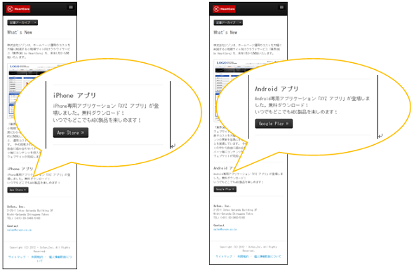
These codes detect user agents of the devices used for viewing, while responsive web design is dependent on the screen widths. Thus you can customize your website content and design more freely by using these codes besides responsive web design.
3.2. HeartCore Responsive Web Sample1 -CSS3+HTML5-
This section introduces a multi-device support sample implemented with CSS3, jQuery and HTML5 as well as CMS “HeartCore” functions.
Brief instruction of the procedures:
- - Decide breakpoints and define them in HeartCore.
- - Replace the breakpoints with special codes.
- - Adjust device specific content as needed.
Please refer to the "Responsive Web Design -CSS3+HTML5-" guide for further information.
HeartCore provides an import data named "Responsive_CSS" which you can use as a sample. This sample uses Twitter Bootstrap. Bootstrap is a framework with responsive web design support.
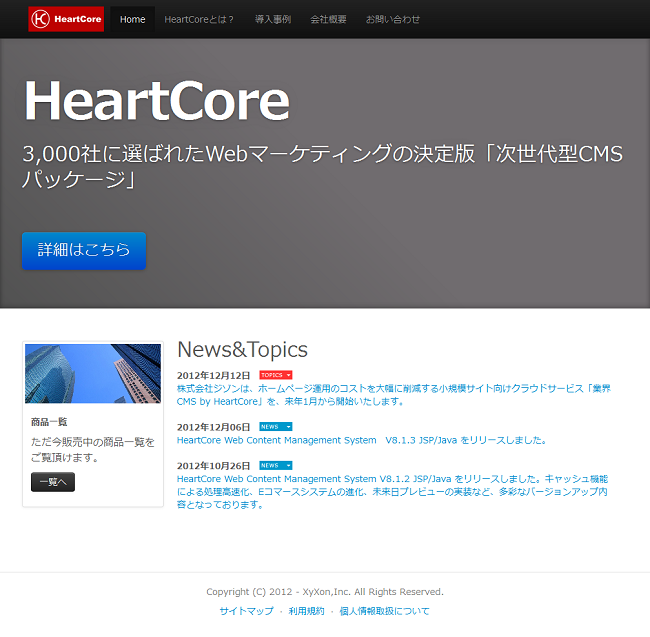
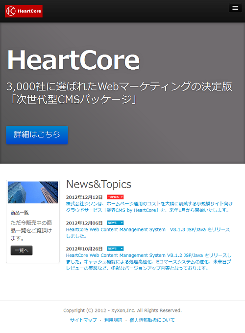
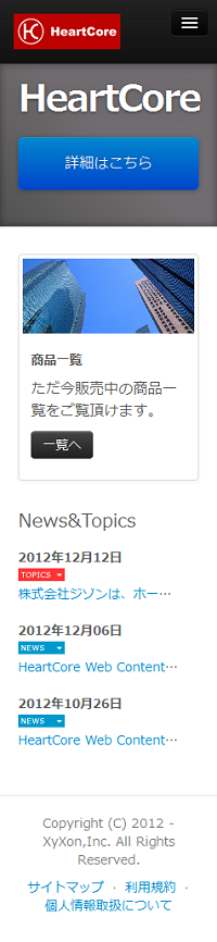
"Top" page -general responsive web design-
Desktop (1200px and wider)
Tablet Landscape (1024px)
Tablet Portrait (768px)
Smartphone Landscape (480px)
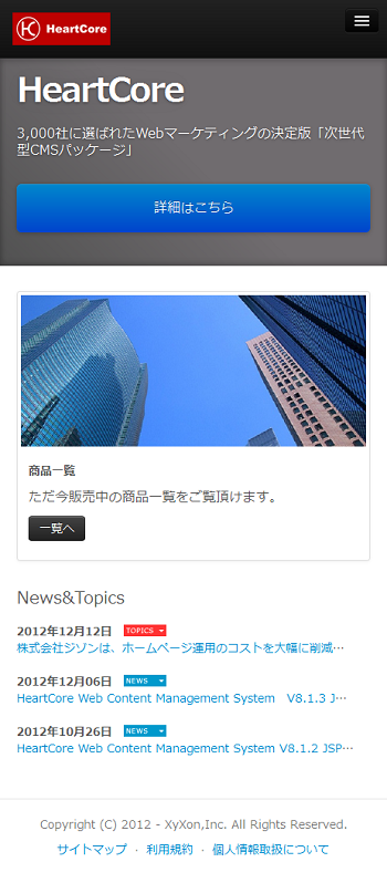
Smartphone Portrait (320px)
Other sample pages are contained as well. Those pages are generated by retrieving data from content database and also there are form pages to post new data such as product information. You can use the sample pages just by replacing with your own content or by customizing according to your requirements.
If the sample data is not included, it can be downloaded from the page below. (Login required)
3.3. HeartCore Responsive Web Sample2 -Micro Websites-
This section introduces a multi-device support sample implemented with HeartCore Micro-Websites and Version functions. This method using Micro-Websites and Version functions is close to a normal website development with CMS than general responsive web design.
Brief instruction of the procedures:
- - Decide target devices and define versions in HeartCore.
- - Use Micro-websites to associate the defined versions with user agents of the target devices.
- - Optimize each element used in a page such as templates, menus and so on.
Please refer to the "Responsive Web Design -Micro Websites-" guide for further information.
HeartCore provides an import data named "Responsive" which you can use as a sample.
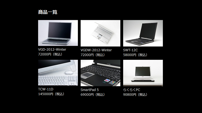
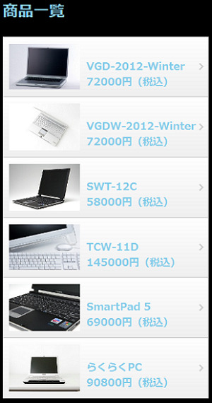
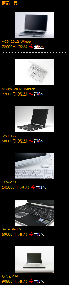
"Product List" page -retrieving data from content database-
Desktop
Smartphone
Feature phone
Other sample pages are also contained such as store information pages, news pages and content posting form pages.You can use the sample pages just by replacing with your own content or by customizing according to your requirements.
If the sample data is not included, it can be downloaded from the page below. (Login required)
Hope you now understand the basics of implementing responsive web design. HeartCore helps you effectively develop a responsive website and reduce time and cost.